
When you look at a world map, do you ever wonder if the sizes of countries are really what they seem? If you’ve ever thought that Canada or Russia looked massive compared to countries like Brazil or India, you’re not alone. The map we all grew up with doesn’t always accurately represent the true size of countries. In fact, it can be surprisingly misleading.
This discrepancy arises because most maps, including the Mercator projection, distort the actual size of landmasses. While the Mercator map is essential for navigation, especially for mariners, it does a poor job when it comes to accurately representing the size of countries, particularly those closer to the poles.
The Mercator Projection: A Historical Flaw
Invented in the 16th century by Gerardus Mercator, the Mercator projection was revolutionary for its time. It allowed sailors to navigate the globe using straight lines, making it easier to chart courses across vast oceans. However, there’s a catch. While it preserves angles, it significantly distorts the size and proportions of countries, especially as you move away from the equator.
As a result, countries in the Northern Hemisphere, like Canada and Russia, appear much larger than they actually are. In fact, Russia and Canada together might seem to occupy about 25% of the Earth’s surface on a Mercator map, but in reality, they account for only about 5%. This optical illusion has led to a skewed perception of global geography for centuries.
A New Way to Compare Country Sizes
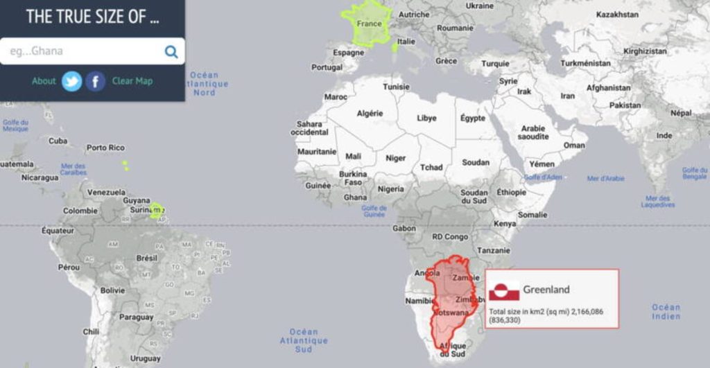
Thankfully, there’s a tool that helps correct these inaccuracies. The website The True Size lets you drag and drop countries onto an interactive map, helping you visualize their actual size in relation to each other. You can compare countries like China, India, and the United States side by side to see how they measure up.
A quick example: When you overlay the Greenland map over Africa, it becomes immediately clear how distorted the Mercator projection is. The Greenland you’ve seen on many maps looks huge, but in reality, Africa is nearly 14 times bigger. The tool gives you a better understanding of how these distorted projections have affected our understanding of global geography.
Alternative Map Projections
It’s not just The True Size that’s working to improve our global perspective. Google Maps, for example, uses a variety of projections depending on the zoom level. While the Mercator projection is still used for navigation purposes (because it maintains accurate angles for roads and borders), it’s not the only option out there. One of the most promising alternatives is the Peters Projection, which shows countries in more realistic proportions, though it can feel strange since we’re so used to the Mercator version.
Understanding Geography in a New Way
Realizing how our perception of country sizes has been shaped by maps can be an eye-opening experience. In fact, this issue goes beyond simple curiosity—it can shape our understanding of global power dynamics and international relations. Many of us, from a young age, form opinions about countries based on the size and shape they appear to have on a map, not realizing that what we see is often an exaggeration.
The creators of The True Size hope that this tool can be used in classrooms to teach students just how much bigger the world is than we might think. As they put it, “We hope educators will use it to show their students how vast the world really is.”
Conclusion: A More Accurate View of the World
Next time you pull out a world map, take a moment to reflect on how that map might not be showing the true size of the countries you’re looking at. With the help of resources like The True Size and alternative projections, you can get a clearer understanding of the world around you. After all, our perception of size can shape how we view global events, politics, and even travel destinations. So why not start seeing the world for what it truly is?